


Paint Color of the Year – 2022
Paint Color of the Year – 2022
The year 2021 continued to be a challenging year full of anxiety, change and hope. Heading into 2022, we are looking to return to a feeling of balance, peace and renewal. We have done a lot of soul searching over the past couple of years and are deciding day by day what things we truly miss from pre-Covid days and what changes we have made that we wish to keep. The color of the year chosen by popular paint brands reflect this inward searching of our soul and our desire to return to a peacefully balanced life with renewed energy and a positive outlook. Below I will reveal 5 major paint companies color of the year and discuss how these beautiful hues make sense in this new world.
5 Major Paint Companies Color of the Year:
Benjamin Moore
Benjamin Moore’s color of the year is October Mist 1495
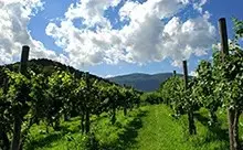
The company describes this color as “Evoking the silver – green stem of a flower” This is a lovely sage color with a hint of silver.
Sherwin – Williams
Sherwin – Williams has chosen Evergreen Fog 9130 for it’s color of the year. The company describes the color as a “combination of green meets gray with just a hint of blue” and as a “versatile and calming hue”. This color is a deeper green than Benjamin Moore’s October Mist.
Behr
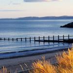
Behr has described it’s color of the year Breezeway MQ3 – 21 as a “silvery green shade with cool undertones”. The company states that the color is intended to “evoke a feeling of coolness and peace while representing a desire to move forward and discover newfound passions” This lovely sea glass green color evokes the wonderful feeling of a seaside stroll.
PPG
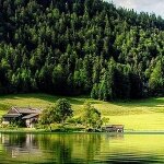
PPG has chosen Olive Sprig PPG 1125 – 4 as it’s color of the year. The company describes Olive Sprig as a “mid tone, neutral, lush green with organic green undertones”. The wonderful versatile green color evokes feelings of being in nature and makes you think of healing and fragrant plants.
Pantone
The outlier to all this lush greenery is Pantone. This year they have created a color to be their color of the year and have called it Veri Peri 17 – 3938. The company states that they have mixed a “Dynamic periwinkle hue with a vivifying red” which “blends the faithfulness and constancy of blue with the energy and excitement of red”
Why Color Matters
The colors we choose to use in our day to day life whether it’s the clothes we wear or the color of our walls and furniture affect how we feel. After 2 years of uncertainty and radical change all of us are craving a return to calm, balance and peace. The paint companies above have reflected that in their color choice of the year. Yes, even Pantone. All colors give off a vibrational frequency that can affect how we feel. We have all worn that red shirt or dress that makes us feel powerful to help build up our courage. In the same way the colors that we choose for our homes will create an atmosphere that affects how we feel day to day. The greens that the majority of paint companies have chosen for their color of the year is meant to create a sense of harmony, balance and security which we are all craving after 2 years of uncertainty and change. Light greens are an emotionally positive color that traditionally symbolizes spring, rebirth, renewal as well as hope and growth. When we choose to use this color on our walls it will produce a gentle calming effect in our homes. The above companies have chosen to mix their greens with gray and silver. Gray signifies maturity and dependability. Silver is the color of illumination and provides a sense of cool elegance and grace. Consider adding these lovely green colors to your home to bring a feeling of calm, peace and hope into your home.
Pantone has not chosen green as it’s color of the year and has instead chosen to create a new color. This will be the color of choice for those who have used the time of introspection to reinvent themselves completely. Pantone’s Veri Peri is made up of a lovely blue color which inspires creativity and freedom. Blue is traditionally the color of wisdom and mixed with red (which is the color of energy, passion and determination) creates a color that is bold yet reassuring. Use this color in your home to create a feeling of excitement for the future with a calm reassuring energy.
The colors that we choose for our homes can greatly impact how we feel. After such a long period of change and uncertainty, the colors above can help us all to move forward with a sense of calm, hope, creativity and even energy. As you go into the year 2022, look around your home and think, does it make you feel the way you would like to feel? After a long day does the color of your home create a sense of hope, peace and creativity? If not then it is time to make some simple changes – which color will you choose as we move into 2022?
Additional Articles